Friday, 30 September 2011

Representing sound through typography


i like this idea of using sine waves to create type, but it doesnt really describe the quick sharp sound of 'pop'.


"Sonotype is an interesting concept: letters as sound. It’s described as a series of experimental typefaces that challenges the arbitrary relationship between verbal and visual communication."


I could use the influence of pop art to design a letter, I think the comic book 'POW!' works very well and could be transferred to the word 'POP' but applying this to a singe letter may be difficult.


Thursday, 29 September 2011

5 Pieces of Graphic Design : Love or Hate

Love      Delicious Design League- Mogwai Poster
  • Clear
  • Eye catching
  • Interesting
  • Relevant to purpose
  • Good colour combinations
  • Nice to look at
Love       Andrew Rae- Print magazine cover
  • Lots going on- busy
  • Interesting/ funny characters
  • Well balanced
  • Colourful
  • Otter in a suit
  • Yeti (?) with a cup of tea


Hate      Why Not Associates- Typography Now cover and layout (1991)
  • I think the main reason i don't like this is because it looks old and outdated, probably because it's from 1991.
  • Colours look like knock-off starburst colours.
  • Inside everything is sideways and overlapping.
  • Some sort of alien hand silhouette on the cover
  • lots of boxes


Love        Jacknife Posters- EOTR Poster
  • Hand drawn
  • detailed and accurate
  • gives a 'feel' of music/ festival genre
  • simple colours
  • clear font
  • not too much information


Love     James Victore- Book design

  • Current
  • Relevant
  • Funny
  • Simple and effective
  • Appealing
  • Up-to-date


Wednesday, 28 September 2011

Research for typography inspired by the word 'POP'


  • Generally curvy letters.
  • Highlights to give the impression of bubbles.
  • lots of circles
  • Bright colours used for fizzy pop labels
  • Rounded corners and bendy lines look 'poppy'.
The e's at the top of the post are sourced from 'myfonts.com' using the word 'pop' and 'bubble' as search criteria, the result is generally rounded and plump letters. I chose to use the letter 'e'because of its lack of straight lines and its quite a 'bubbly' letter.

Sunday, 18 September 2011

Saturday, 17 September 2011

Map Research


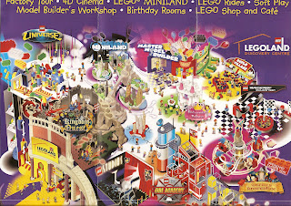
Examples of Theme Park maps in leaflet form for 'How to..' brief