Thursday 28 March 2013

Forum and Interface Design - Good Is

For the interactive touch screen table elements of the bar I need to research into successful interface design and consider that it could be being used by drunk people, therefore must be user friendly.
For the forum aspect I need to look into what the restrictions are when designing forums and hopefully find some examples of forums that break the rules of a standard forum.

I think that this forum is relatively simple and easy to navigate but could be improved upon


The majority of forums have this kind of layout which is very text heavy and difficult to digest.


Incorporating nice images may help to make the experience more relaxing and interactive.


If I could keep the rustic / traditional themes that the bar has and transfer it the UI design then I think that would be relevant and effective.


Monday 18 March 2013

CoP Publication: Format

The format of the publication should reflect the content in some way.

A few ideas that would be relevant to the content of my publication are:


  • Directly copy and existing layout and design, simply changing the content
  • Don't use Creative Suite and only use Office and online facilities
  • Follow stylistic fashions and current trends
  • Design in a way that is inimitable- creative and experimental publication
  • A series of publications that offer different perspectives on the topic- designers, operators of Vista Print etc, clients, businesses that use Vista Print for templates etc.
  • A collection of the same publication in a series of different styles to show that style does/ doesn't affect content.
  • Look into other things that imitate each other/ follow trends (nature, Lyre bird, mannequins?) design in style of this.
These are some formats and editorial based design that I find aesthetically pleasing and effective:

six 08/09 limited edition promotional mailer

I could incorporate holes/ acetate in the pages to illustrate certain points I make:

Coalesce

raul_arribas151


Designing a range that work together and offer different ideas/ viewpoints could be effective

photo

Incorporating tactile and interactive elements will make the publication stand out and easier to take in and engage with.

Graphic design / Design for GDFB Catalogue 2010 by Rob van Hoesel

uuo (Illustration: “The Cosmonaut”, Marco Goran Romano.)

The Universe on Behance

This poster captures the essence of the content of my publication:

The Rules by Batoul et Mehdi.

CoP Publication direction

The question that I want to explore with my context of practice publication which carries on and links in to my essay content is: As designers, how much attention should we pay to style and trends, and what attributes of a designer can not be easily replicated?  I will look into existing online programmes that generate 'design'  and ask what is the difference between potential clients simply doing it themselves. 
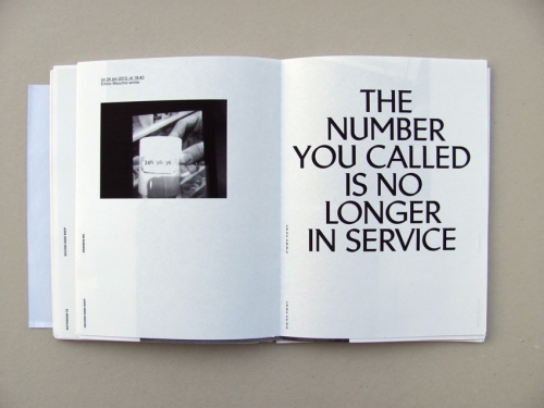
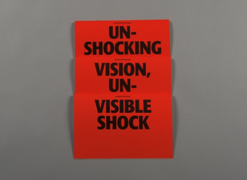
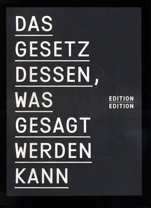
The publication will be based around the ideals of Modernism and anti-decoration and trend.


Online facilities that mimic the job a designer:

This site allows users to generate basic signs and set type


It offers a wide range of typefaces that goes beyond the standard set that comes with any design package


Although there are a lot of very dodgy and horrible typefaces...


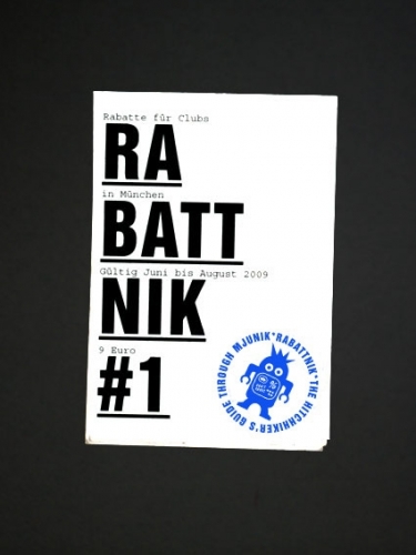
There are a lot that are very similar to fonts that can be seen in 'trendy' design today

(Generated using the program)


in comparison to:

the last supper


There are also much more garish possibilities that I'm sure will be popular for some reason:


What stops design being so imitable?

This online resource is hard to use and is very restricted in comparison to basic Word processing software which offers a lot more freedom for moving type and layout.

This site: http://www.trendlist.org/  documents all new trends emerging within Graphic Design focussing on popular aesthetics and styles and no information on content. What is stopping anybody having a look on here and simply imitating a design?

TAG DER OFFENEN TÜR

TAG DER OFFENEN TÜR

Un-Shocking Vision

DAS GESETZ DESSEN, WAS GESAGT WERDEN KANN

Rabattnik

Trend list offers an even more useful poster style generator that allows trends to be copied with ease:


Even more daring design can be replicated easily:


It is almost difficult to go wrong with this generator and if something like this was printed off and held up whilst someone photographed it, it could quite easily get noticed and popular on inspiration sites etc.

Websites such as vista print and Moo offer loads of templates and stock images:
\


I'd say that Moo offers some really nice templates that look professional and if you weren't aware of Moo templates you could be tricked, easily, into thinking that it is custom work


Furthermore, there are many very cheap website builders that offer layout options and functionality that probably exceeds a lot of designers capabilities for half the price.


This is the deluxe package that is only £2.72 a month - this probably goes up after a few months but is still relatively cheap


The user can choose a template they like and are then in control of how they make it look with no need to complain to a designer that they don't like the typeface or colour. It seems like an easier and cheaper option than actually paying a designer and explaining what it is that you want.


This is the direction my publication is going to go, essentially asking "What makes design Un-imitable?" 

I will email designers to ask their opinion, along with some businesses such as Vista Print and Moo to see how their answers differ.

Friday 1 March 2013

Small Talk: Social Environment

I like this idea of typography on tables, I could utilise this to put conversation topics on or dares for people to go to other tables and talk to people.


I want to do some 'scene' photography of my finished products that is relevant to the branding rather than just photographing it neatly:


Using illustration heavily in the identity works very well towards making it livelier and more exciting.


Steve Simpson does some amazing illustration and applies it to the branding of branding and packaging, this gives the product a very personal and engaging aesthetic


Combining photography and digital typography is something that I could look into:


I love the look of these old style letterpress posters, however this - kind of - aesthetic has been used recently be Scream Pubs so may not stand out much against the competition.