Thursday 28 February 2013

Type Workshop 3

Construction

Before applying a grid you must understand the requirements of the work being produced.

Using more columns gives you more scope for arranging and accommodating text and illustrations.

Disadvantages of having too many columns in a grid are: lines will be narrow, small type needs to be used.

For stats, figures and graphs- use 4 columns per page.

The narrower a column is, the smaller the typeface

Do not rely on just one set of thumbnails.

Applying type to columns

10 point type / 15 point leading

Column length of 15cm= 15 pt leading=10 lines per third=30 lines every 15 cm

Task

Make a concertina fold, no littler than 5 panels no bigger than 16,
use a mixture of the grids that we have learnt about.

To set up for a concertina: 

Untick these:

Drag and drop the pages next to each other


Ask Me Anything's

Small talk is becoming a thing of the past in the real world. Nowadays the majority of conversations with strangers is done online, via forums, chat sites or instant messaging.

An aspect of this that has been gathering a lot of attention lately is Iama's, where people state what makes them unique and allows everybody to Ask Them Anything:

This ranges from interesting people that live in extraordinary ways to celebrities and politicians.

Here a 'Dwarf in a wheelchair who plays in a band' is offering the people of the internet to ask him anything they want.


I think that this feature really encapsulates what small talk used to be- finding out interesting things about peoples lives- that we hardly get the opportunity to do these days


Sometimes it is the people that have the most mundane jobs that have the best stories and answers to questions


It is also becoming more common for celebrities to do 2 hour or so AMA's usually when they are plugging an upcoming film etc.

This gives people the opportunity to personalise their own interviews. If somebody suggests a good question then the community can upvote it so that it is more likely to be answered

Here are screen shots of Gerard Butler and Bill Gates' AMA's


This is a really versatile facility that can engage people in serious debate or bring people together over a shared interest.

I think that something similar to this would be effective in real life, where people can actually meet other real people.

The bar that I am branding could have special nights in which they get a certain celebrity to do an AMA and the customers can submit questions from stations in the tables that will then be answered and displayed on a large screen in the bar. This will give all customers something in common/ a shared interest that they can start conversations from, these nights could also have a professional edge that will allow for networking and useful socialising.


Tuesday 26 February 2013

Packaging and Structural design

I am interesting in the structure and build of the packaging, we need to make a unique and engaging experience for the user that is unlike any existing perfume packaging.

I have looked at existing medical packaging and products that have a similar application to the one we are dealing with,

This, like most medical packaging, is very minimal and modern being predominantly white with just one bold colour and mostly Helvetica.


Other products in the range follow the same aesthetic guides which tie the set together as one.


This collection uses a lot of varied colours which makes it weak as related products, it just looks like a random array of things. This is not only due to the colours not being the same but because the colours don't compliment each other very well which makes them look dated and of poor quality.


THese products have been photographed in a very digital and 'plastic' fashion, the use of additional objects acting as props helps to build the identity of the product and also add trustworthiness and professionalism to the range.
Again, each label is very similar with only minor layout changes to suit the different label sizes:


This range is very simple using only a set of numbers to differentiate between the varied products. This works quite well together but each individual bottle isn't very aesthetically pleasing and isn't something that you would want to display or feel inspired to use.


From Structural Package Designs (745.541 Library)

This net is similar to most packaging for medicine that has room for the drugs and explanatory leaflet. It is easy to get into and there is no time wasted messing with unnecessary packaging.

As we are packaging for fragrances we are able to experiment more with the net and develop more of an experience that the user is involved with.


Mock Ups of these examples can be found on my design practice blog: http://c-shuttleworth1114-dp.blogspot.co.uk/2013/02/packaging-design-mock-ups.html


Big sliding lids like this offer a big area for aesthetics on the outside and considered presentation inside similar to the packaging of Apple products.


This packaging has a bottle support circle built into the top, we could use this to package equipment to dispense the perfume such as a pipette.


A swing lid seems to have quite a lot of mystery behind to it like a treasure chest, which could lend itself to the fragrances that are being sold being seen as 'bottled emotions'. Like the product is something a bit mysterious and ancient.


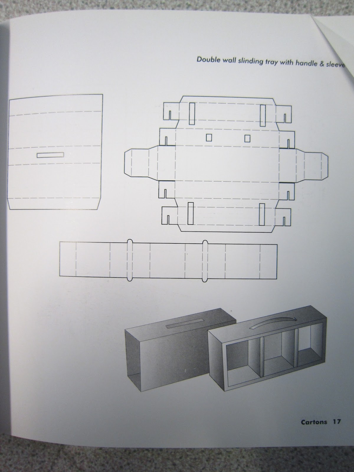
I like the idea of this package as it has many layers that could be utilised to optimise user experience. The lid could feature branding, the flaps could be used in a way to describe the contents or give more information, then there is a second lid on the base of the box which could contain hidden information etc.


This box has 2 openings that could display opposing sides of the bottle inside, this could be used to describe two opposing emotions or could hold two fragrances that offer two opposite emotions/ chemicals.


The idea of tearing into the packaging could be used to package an emotion that has links to aggression or power so that the experience of the user is relevant to the product inside.


This box would lend itself well to the medical theme of our concept, there is a small viewing window that the bottle can be seen through it also is easy to get into and access the 'medication' .


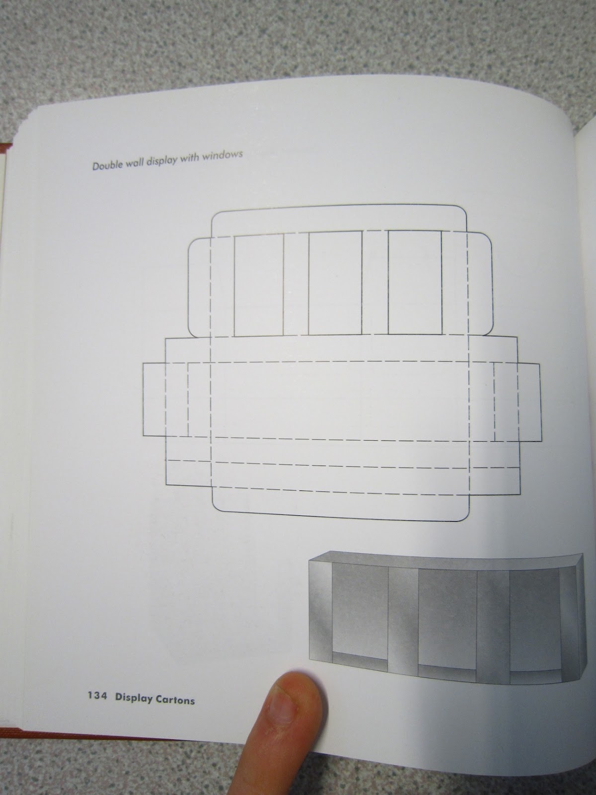
This net could be utilised to sell all the scents together, The net could be adapted to house 4 bottles rather than just 3:


Similarly this net displays contents using a clear acetate window, however doesn't look as interactive and robust as the above design:


This hexagonal net could be used as it relates to the molecular structure of the chemicals we are selling:


This long package could house a syringe of perfume to be used as a tester or sold as a small sample of the fragrance:


This folding wallet could be used to contain to sets of perfume tablets, that could then be removed and carried around in a handbag/ purse:


Monday 25 February 2013

Good: Aesthetic Style

I want the general aesthetics for the work I produce in this project to be friendly, engaging and optimistic. I want to combine a lot of illustration into the identity of the bar;

This doesn't, however, just mean make everything busy and hand drawn choosing appropriate typefaces and colour will be very effective in attaining the mood that I want to communicate.

This typeface and simple shapes doesn't look static or cold despite being a uniform shape and just black.


Neat vector illustrations are interesting, vibrant and lively and would lend themselves well to communicating a guide to small talk etc.


Bold and simple illustrations on wood or other materials could work well as interior decoration to add to the identity of the bar.


Simple illustrations and vibrant colours successfully achieve the aesthetic that I am trying to apply to the range of products for the identity of the bar.


I want the material to make a statement about the lack of socialising that is done today and I want to encourage friendly talk amongst strangers. Using bold statements such as this one will help to achieve this.


I want to incorporate a lot of illustration but this should not lower the quality of the design- layout, relevancy and type should work to complement what ever illustrations are present. I think that Ryan Feerer combines these two elements very well and I will use his work as inspiration and reference when designing in this project.


Nation of shopkeepers is a local pub/ bar that has a very lighthearted and playful aesthetic, I will document more of their material to understand how they tie all products together to be recognised as Nation material.


Throughout all of this short publication Nation use the same typeface style which suits the illustrations very well, there isn't any limited colour palette but I think that the blue and burgundy on the 4th image could be better suited to the rest of the publication.


Clear and straight to the point:


Music is something that everybody has in common at Nation of Shopkeepers which is a good conversation starter, my small talk bar could feature events that attract like minded people so that connections can be made easier.


Concept Boards

Friday 22 February 2013

Further Small Talk Research

Locations where small talk would actually come in helpful (rather than just existing to fill an awkward silence) would be:


  • First day at work
  • Internships
  • Work Experience
  • Starting University / College / High school
  • Exhibitions
  • Parties

This post really sums up what I am trying to communicate :


The hardest part of this brief is finding an application that would make the content effective

“You can make more friends in two months 
by becoming interested in other people
 than you can in two years 
trying to get other people interested in you.”
 Dale Carnegie


Thursday 21 February 2013

Small Talk Research

Wiki definition:


"Small talk is an informal type of discourse that does not cover any functional topics of conversation or any transactions that need to be addressed.[1]"

"The ability to conduct small talk is a social skill"

Potential topics for small talk:
Pretty much anything to do with the weather is the majority of all small talk.


Small talk is essentially the opposite to this:


"The level of detail offered should not overstep the bounds of interpersonal space. When asked, "How are you?" by an acquaintance they do not know well, a person is likely to choose a simple, generalised reply such as, "Fine, thank you." In this circumstance it would probably not be appropriate for them to reply with a list of symptoms of any medical conditions they were suffering from.[11] To do so would assume a greater degree of familiarity between the two people than is actually the case, and this may create an uncomfortable situation."


I could exploit this idea of being completely inappropriate with small talk to achieve a light hearted and humorous tone of voice.

It is quite interesting that female small talk generally consists more of compliments and focus on appearance whereas male small talk consists more of playful insults and put downs.

Small talk in business:
http://www.telegraph.co.uk/finance/2857204/The-art-of-small-talk-can-help-clinch-a-deal.html


I have watched a few videos and documentaries that are based around small talk. This documentary is called 'The Lift' and is directed by Marc Isaacs in 2001.


It reminds you that the majority of people are considerate and interesting people that have their own problems and ambitions.
With my project I want to encourage starting conversations with strangers and finding out a little bit about them which seems to have got lost amongst the vas tinflux and development of technology.


After mind mapping potential avenues that the project could take me down, the areas that I was most interesting in developing further were designing for web and branding across a range of products.


The bar could feature an elevator and have vinyls to do with the topic etc.


I could also look into designing for bottles, wayfinding, t shirts, an app, website, coasters, toilets etc.


Swallowable Perfume


This concept is still in the development stage but it is a very relevant application to what we are producing in response to the brief.


Using the idea of swallowable perfume we can make packaging for tablets and pills as well as traditional liquid in containers to really introduce a new approach to perfume packaging and design.

The idea of the tablet is that the scent will be excreted through the pores of your skin, similar to if you eat a lot of garlic.
Although this concept may be a bit much for some customers/ clash with their personal ethics or morals I think that it would fit perfectly with the audience we are aiming our new experience perfume at.

We will design our main packaging and advertising for the traditional bottled perfume which is dispensed through a dropper in the lid and we will also mock up the idea for swallowable tablets to submit as a proposal to illustrate where the brand could go/ how the range can be extended.


As it is now a possibility to package tablets as perfume I will research existing tablet and pill packaging to see what is already out there and how effective it is.

I found this Beechams packaging which is unlike any other I have come across:


It comes in a wallet form that closes firmly but isn't a struggle to open, the design is compact and handy for carrying around in a bag or a purse.


Each pair of tablets can also be torn off to just put in your pocket or dispose of when it is empty.


The closing mechanism is very simple but effective:


It may be worth considering portability when designing for perfume tablets as the users may want to refresh their smell while they are out of the house and wont want to be faffing around with multi layered packaging that is difficult to put back together and use.

Tablets could be packaged in a more aesthetically pleasing way than traditional medical packaging:

Using colour coded 50/50 pills could be utilised to communicate specific scents etc.


Tubs like this could be used to house larger supplies of swallowable perfume, designed to be left at home and consumed before going out.