"Produce an appropriately designed 'info-pack' of things to know, consider or remember in order to produce successful Design for Print."
These 7 important things will form the key aspects of print that my publication will cover:
Colour
Colour Models
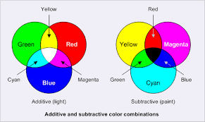
CMYK & RGB

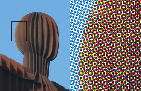
CMYK is generally used for most colour printing, especially if photographs are involved, different value and angles of each CMYK value add together to create a wide range of colours and colour photographs. RGB is used for any screen based design.
CMYK is an additive colour mode - when colours are layered the result is darker than the 2 colours that made it.
RGB is a subtractive colour mode because it is made from light, the more colours that get layered the closer the colour gets to white.
Pantone Matching System
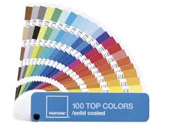
Pantone is used as an international reference system, this allows designers to communicate over the phone and specify the colours that they need without any chance of it getting altered in translation - if the Pantone code is communicated clearly
Hexachrome
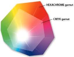
Hexachrome is similar to CMYK but it uses 6 colours ( CMYK + orange and green)
this allows a wider and more vibrant spectrum of printable colour.
Spot Colour
Spot colours are used with reference to a colour matching system like Pantone that allows colours to be reproduced without any alterations.
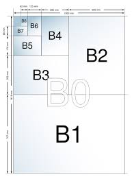
Format
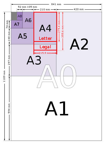
ISO sizes are the international standard for paper size this covers all A sizes, B sizes C etc..
The common paper sizes differ country to country but these standardisations allow communication between client and designer with no confusion.
Standard newspaper sizes:

Stock
80# Gloss Text
Standard glossy paper stock, about as thick as a light magazine cover. The shiny finish provides an excellent opaque base for rich process color printing. This is our most popular type of stock for Brochure printing, Catalog Inserts, Flyers, Posters, etc.
100# Gloss Text
Similar to the 80# gloss text, but 25% thicker and heavier, for a more substantial feeling piece. Standard Uses: Brochures, Information Sheets, Self-mailers, Posters, Door Hangers, etc.
80# Dull/matte text
This stock is finely coated with a non-gloss finish. It provides an excellent opaque base for easy to read, crisp typography. Standard Uses: Brochures, Newsletters, Catalog Inserts, and Flyers, etc.
100# Dull/Matte Text
Thicker and heavier than our 80# Dull/Matte text for a more substantial feeling piece. Provides a non-glossy, opaque base for detailed, crisp printing.
80# Dull/Matte Cover
Our dull/matte cover is a thick 9 pt cover stock with a smooth, non-shiny coating. It is well suited for detailed, crisp printing without sacrificing the ability to easily write on the paper. Often selected with the 80# dull/matte text option for inside your catalog or booklet piece.
80# Gloss Cover
As a "cover" stock, this paper is stiff, about like a postcard or baseball card. This stock is coated with a glossy finish, making photographs and other images look beautiful. Standard uses: durable, heavy-weight Brochures, Catalog Covers, Product Spec Sheets.
100# Uncoated Cover
An option for business cards, rack cards and bookmarks. This bright white smooth #1 grade cover stock is 14 pt in thickness and matches the 70# text-weight stock we use for letterhead and envelopes.
120# Gloss Cover
We offer this high-quality, thick 14 pt stock on all of our card products. The glossy, coated finish makes photographs and other images look beautiful. We include aqueous coating to your four color sides for added protection and shine.
120# Dull/Matte Cover
Our dull/matte cover is a thick 14 pt cover stock with a smooth, non-shiny coating. It is well suited for detailed, crisp printing without sacrificing the ability to easily write on the paper. An excellent choice for Business Cards, Postcards, Note Cards and Greeting Cards.
70# Uncoated Text
We exclusively offer 70# Lustre for stationery, envelopes and newsletters. This ultra-premium uncoated (non-glossy) white stock is guaranteed safe for desktop laser printing. Many common stationery stocks are not optimized for 4-color printing, so we have selected this for best results. Feels thick and substantial in your hands, and is the best type of uncoated paper stock available for full-color printing.
24# Uncoated and 28# Uncoated
This is a standard stock commonly used for envelopes, also called White Wove. The 28# is thicker and heavier than the 24#.
Aqueous Coating
We include this clear water-based coating at no extra charge when you select a paper with gloss finish. Aqueous provides a high-gloss surface that deters dirt, fingerprints and scuffmarks. It protects pieces such as postcards and brochures as they go through the mail and business cards as they ride around in people's pockets.
UV Coating
UV coating is a highly protective, ultra-shiny gloss coating that we apply over aqueous coating and then cure on a special machine using ultraviolet light. The solvent-free UV coating provides an extremely hard finish that's chemical and abrasion resistant. It makes details really pop! On deep colors, it results in a stunning, almost wet appearance. Perfect when you want an environmentally-friendly and durable piece with a richer, high-end look and feel.
NOTE: UV Coating cannot be used on the addressed side of mailed pieces.
There is a huge variety of stock, most printing companies offer a small selection of the stock they offer, here is a selection of some of the stock that is on offer at Moo.com, they have gloss and matte finished stocks that range from 200 to 600gsm

Artwork
Print marks

A: Start Target B: Label C: Registration Marks D: Black Overprint Colour bar E: Crop mark F: Gradient tint bar G: Progressive Colour Bar
Start Targets and, more commonly Registration marks are used by the Printers to align the different colour seperations.
Crop marks are there to make cutting the printed area out neatly
Spellcheck


PreFlight Check
A Pre Flight Check or Pre-Flighting is a feature that you can use to check that all files are linked and present, that all the colours are correct and all typefaces are embedded to make sure that there are no problems when you send the document to print, which would result in wasted time, extra cost or a poor product.
Proof
A Proof in printing is used to give you an idea of if what you have on screen is going to work/ look the same when it is sent to print. You can use Adobe features to 'Proof Colours' to make sure that none of your chosen colours lie outside of the CMYK colour gamut, you could also print a physical proof on a printer to get more of an idea of what the colours may turn out like if your monitor has not been colour synced properly.
Sign off
Signing off is used when dealing with clients to make them commit to the design and remove the possibility of them changing their minds after a print job has already been printed. This involves making the client physically sign the intended proof copy of a design before sending it to print.
Fonts
Before sending your files to print, first you should print a cheap copy of the document to ensure all type is large enough to read (considering the age of people who will be reading it). If the design is okay, you must then make sure that you either create outlines from all the type in the document or you supply the relevant fonts in a folder alongside the documents that you are getting printed.
Print Processes
Foil blocking
Foiling can be expensive and often quite difficult if trying to do yourself on a low budget but, when done properly it produces some really good results:

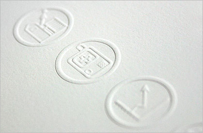
Embossing/ De-bossing
Embossing and de-bossing is almost the same process, except with embossing the type/image is raised and with de-bossing it is pushed into the paper. It is made by creating a wooden or metal 3D mould of what you want embossing, this is then clamped into the paper creating a 3D impression directly into the stock. Thicker weights of stock and more absorbent stocks work best with this process.
Spot Varnish
Spot Varnishes can be specified when sending a product to be printed lithographically, this is done by using a swatch titled 'spot varnish' and clear communication with the printer of what you want.
Spot varnishes give a very professional and neat finish to a product:

Finishing
Binding
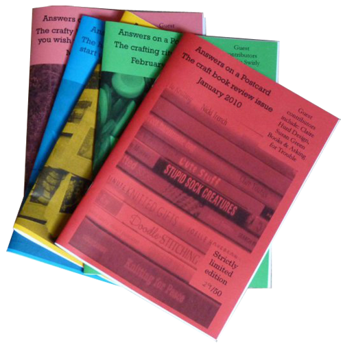
Saddle stitching - Stapling through the centre fold
Perfect binding/ case binding - Commonly used for hard cover binding, pages are grouped in around sets of 16's and glued together at the spine, tape is then used to hold it all together and cover the edge.
Comb Binding- Allows books to be opened flat, holes are stamped on the inside edge of every page and held together with a plastic comb.
Coil Binding- Similar to Comb binding except this uses a metal coil to hold the pages together.
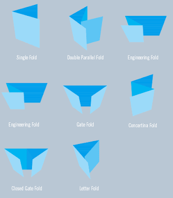
Folding and Creasing
Simply folding a publication in an interesting way can instantly give it much more appeal than if it were just another flat A format flier:
Die Stamping/ drilling
Die stamping fully takes away a section of the printed material, leaving the finished product with a hole, or it can be used to stamp out multiple nets without the need of cutting them individually.
Costs