
Identify a minimum of 5 examples of the effective/creative use of print in the following areas of design:
- Branding and Identity
- Packaging and Promotion
- Publishing & Editorial
- Information & Wayfinding
Branding & Identity


Cuckoo is Adelaide’s foremost underground electronic music, cocktail and tapas bar.
These business cards designed by Studio Band stood out due to the non-uniform typography, the colour and type doesn't give very much away in terms of what it is promoting, but this suits the 'underground' nature of the bar- it only makes sense to those 'in the know' which will attract a loyal custom. The designers say that they have used the differently weighted type to represent to diversity of electronic music played at the club. Pastel colours have been used throughout the branding of the club on the menus as well as the business cards which work well with the, generally. monotonous interior design of the club.


What grabbed my attention about this branding was the vast colour palette used throughout all the products which stands out from the 'keep it all as similar as possible' approach I'm used to seeing in branding to tie all products tightly together. This works well because the vibrant colours are used throughout and work well with the vivid photography and offers something a bit different to what you would normally associate with luxury holidays.


'Hudson Made' specialise in making and selling expensive and fancy products such as mahogany chopping boards with wooden chalices and olive oil. This niche market calls for an old fashioned, hand made and well made brand. Hovard have chose rightly to use letterpress and a custom stamp and to photograph the branding next to these solid machines that look reliable in creating a product. However I think that what Hudson Made actually do isn't communicated very well in the business cards, it is clear that they make something but it is unclear what, but then again they don't really make one product they make a variety, so in this respect the branding suits well.


I'm always tricked into paying more for food if it has a really fresh, neat and cool brand. This sandwich shop in Brooklyn has been given some great branding by Tag Collective, they have used illustration really well which, i think, is generally avoided with cafe/ restaurant branding. The use of fly posters and a Komika style type will make this shop appeal to a younger, hip market interested in good design and good food.


This bright, vibrant and fun branding instantly makes you imagine the great atmosphere at this restaurant. Savvy Studio have taken the neon colours from Tokyo to inspire the branding of this Japanese Sake Bar, they have kept the type and colours consistent throughout to create a solid and coherent brand with a unique personality.
(Primary Photograph)

I found this hand painted wall in York over the summer, I have no idea if there is still an Ironmongers there but the sign looks relatively new so I think that there might be.
This sign is very no frills, it represents a solid and quality job with no messing around, which is exactly what you would want and expect from an Ironmongers. This connection is made my using a heavily weighted sans serif type and the use of solid black and white.
Brand Union


I was impressed by this logo for the Brand Union which is a design studio specialising in branding. It exploits the negative space from the counters of the letters which creates a unique logo that is a bit like a puzzle for the viewer to solve. The use of relatively muted and neutral colours make it pair-able to a variety of other colours without creating too much uneasy contrast. It conveys out of the box thinking and a solid, concrete identity which would appeal to potential clients.
http://www.behance.net/CommonerInc

This old fashioned branding works really well for this barber shop. The dated look gives it a reliable and trustworthy efficiency that men would want when going for a haircut. It also makes the customer think of the friendly environment and comfortable chatter that is associated with the sort of 1940's/50's.
It uses a strong sans serif font and patriotic eagle as its identity which communicates a strong and masculine, no fuss attitude to hair dressing that would really define their target market.
http://miyostudiosblog.com/branding-bone-daddys-identity-package

http://www.behance.net/CommonerInc


Packaging and Promotion


This packaging is for Rum with honey & a touch of lime, the main selling point being the honey. The obvious choice of colour for selling something with honey would be yellow and black which I think would be quite difficult to do something new and unique with but Periera & O'dell have done it seemingly effortlessly. The box also references the honeycomb shape and with the neck of the bottle coming out of the box looks a bit like one of those wooden spoons used to serve honey. The design looks appetising and not dangerous which would be a risk when using such bold yellow and black.
http://www.jwt.com/brasil


Awesome peel-able packaging for a new range of fruit based Smirnoff Vodka, the packaging is very minimal with just the skin of the fruit covering the bottle, this lack of information will instantly catch attention and inspire wonder in potential customers. If you look closely you can make out the recognisable shapes of the smirnoff label beneath the skin (top picture) so you would know what you are purchasing.
http://www.strangerandstranger.com/


This packaging has been designed by Stranger & Stranger for themselves as a little Christmas design and potential client gift. This company has so many good designs, specialising in alcohol packaging and branding. This is done so well, all consistently sticking to the vintage style the busyness and amount of type makes the product look really interesting and the packaging really adds to the drinking experience, as if you are drinking in a different time with different people and it stands out so much from the, generally, minimal packaging that is around today.
http://www.behance.net/stickmandesigns


This packaging works well at putting a bit of personality and excitement into a mundane and everyday object. The bright colour palette is consistent throughout product and packaging and boasts quality and durability with heavy capital type, exclamation and call-out.
http://www.p-and-w.com/


P and W have considered how cartons could work together with this packaging to create a carton that the user can hold and turn and interact with rather than it just serving its purpose of making it clear what flavour it is, this fun and vibrant illustration gives you a feel of Spain as well as a taste of it.
I think that the cartons really stand out on the shelf and I love the high contrast between the carton colour and the orange circle because it is quite 'offensive' with the use of complimentary contrast and is often avoided in packaging.
Publishing & Editorial

This is a new take on a magazine cover, a picture of the cover on the cover with annotations, I think this works well to remind the buyer what the Big Issue is about, helping the people selling it rather than just the content of the magazine. The busyness and lack of grid is also a bit different and exciting.
http://www.jeanjullien.com/


I like the use of hand drawn techniques in editorial design as it is something that is being used less and is often ignored because layout is very centred around the use of the grid. Although the grid is still used the addition of hand drawn illustration adds some character and life to the spread.
http://www.behance.net/gallery/247-Tel-Aviv-based-Magazine-by-Moshik-Nadav/584666


This layout effectively uses the grid to fit all this information into this modernist design. The minimal use of colour works well to tie the layout together as a whole but the lack of variety may cause the information to be boring and a chore to read quite quickly.
http://www.behance.net/gallery/WIRED-Magazine-(ita)/337563


Simple but detailed illustrations work well in this piece of editorial design to communicate a mass of information in an interesting and engaging way. I think that the last of these 3 images works the best, mainly because of the 3 colour palette, the other 2 images have a bit too much going on which makes it confusing and pushes me away rather than draws me in.
http://www.behance.net/gallery/Festivais-Gil-Vicente-2011/1625379


This style has a good balance between the experimental, readability and clarity. The colour not being bound by boxes makes the layout flow together well and the lack of straight edges gives it less of a cold, digital aesthetic. The designer has done well to break up the mass of text with the use of colour and line breaks. However this sort of layout is happening a lot recently and I think that more could be added to this to really promote the film festival it is advertising and induce more intrigue and excitement in the reader.
http://www.behance.net/CommonerInc


Henry Moore Institute- Programme 2012-2013
I recently had a look around the Henry Moore Institute in Leeds, I didn't think much of the art, it was generally nonsensical sculptures and tights stuffed with fluff, but the programme was well designed..

The front cover had a small amount of foiling for the title, this instantly defines the audience that would be visiting the gallery as high class and sophisticated. The heavy use of light serif fonts also makes the programme appear very cultured and educated.

The inside layouts feature big, full colour pictures and neat, left justified body copy, this gives the programme a clean and minimalist aesthetic which suits the gallery and exhibition. The body copy is a crisp sans serif, keeping the content very serious, the information is all very uniform as well which all add to the seriousness of the subject and communicate to the reader that a lot of thought and hard work has gone into all the pieces on display despite them being a bit ridiculous and, sometimes, funny.
Free Cookery guide from The Telegraph
The focus of this publication is the food so the type on the cover has a neutral colour and a light weight. Throughout the colour is kept to a minimum, using only one or two, again to not draw attention from the pictures. The audience for this is a sophisticated adult, hence the mature type and neat layout.
All type on the inside pages is relatively small and there is little hierarchy as it is the pictures that you are supposed to look at first and then read the information and instructions if you like what you see.
All recipes stick to the same formula to keep the publication consistent, coherent and functional.
Republic-Free magazine at till
Different to the previous two publications this one is very busy and energetic, this is because the shop's market is young, trendy and alternative people. The 'REPUBLIC' has a plastic, glossy finish which gives it a trustworthy and quality personality, along with the all caps and underline it automatically makes you think that you can trust them on what's cool.

The inside spreads are full of information, covering lots of different fashion styles and music tastes this is to try and hit something that will appeal to everyone, expanding their market, including cowboys and goths:

The, apparent, lack of grid makes you flick between all the images rapidly, trying to absorb all the information, this forces you to spend longer looking at the spreads and giving them a vibrant and lively feel.
Information & Wayfinding
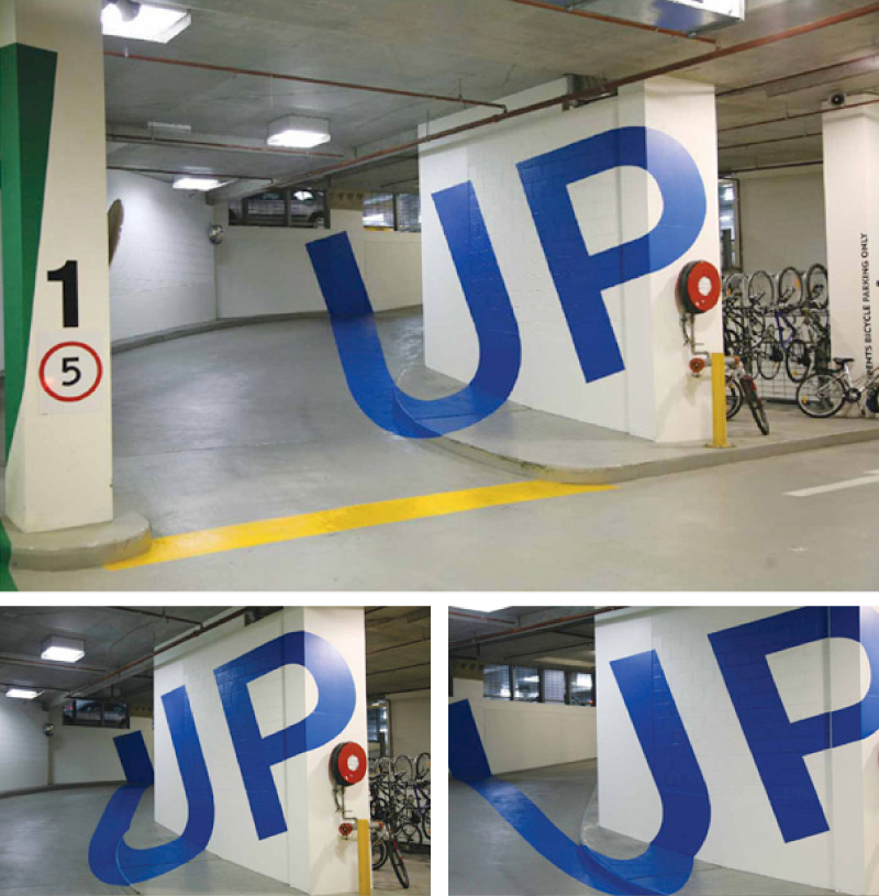
I think this is the perfect solution to the horrible signage most multi-storeys have. It's blatantly clear, bold and eye catching. The only problem with this might be that it will cause a distraction for some drivers, potentially causing an accident.
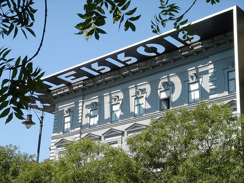

This is credited to the architects rather than graphic designers but it is still a clever use of material. This is the 'House of Terror' museum in Budapest that uses a horizontal stencil of the word 'Terror' which when the sun is shining casts the sign down onto the building. This has reference to night/ day and fear. I like how the sign will be constantly changing and relies on something natural for it to change, the only catch is when the weathers rubbish.

Apart from an appealing aesthetic the most important feature of an infographic is interesting, concise and unique research. I like the space on this infographic, it isn't too overwhelming like most, it's a nice amount of information and the topic is interesting and relevant to most people, along with nice illustration and only relevant (and short bursts) of type I think this successful.

The colours in this infographic work very well with the use of colour and greyscale photography, along with a different, interesting and slightly controversial topic it is engaging and provocative. Again, not too much text keeps it from being overwhelming and deterring people from reading it.

Old painted walls are always interesting, this one is from the late 1800's, these signs were painted by people who were known as 'wall dogs'. The bold complimentary contrast of this sign helps it to stand out against the wall, however it doesn't really communicate 'Antique & Elegance' which is allegedly what it is trying to promote.


These signs are positioned around the York wall walk, they keep you up to date with where you are on the trail and give you historic information about the point you are at. It isn't the most engaging or innovative way-finding design ever but it does the job and is clear and coherent which is its main function and necessity.
No comments:
Post a Comment