Using colour in print, examples of CMYK, Spot Colour, Monochrome and tints.
- CMYK (process)
- Spot Colour (2 or more)
- Monochrome & Tints (solid colour and half-tone)
Packaging & Promotion
CMYK
These fliers have been printed digitally using CMYK, as they are relatively short runs that need to have new editions printed regularly so they are very ephemeral and this would be the most cost effective way of doing it, especially considering the amount of colours used in the Propaganda flier.
Spot Colour
This Boost wrapper uses about 3 spot colours ( and potentially a half tone used to create a lighter blue from a dark blue)
This Wilkinson bag has been printed with a red spot colour and then the yellow has been printed over the top, you can see around the edges that there is a darker shade of red due to additive colour.
All big brand packaging use spot colours so that, regardless of where it is going to be printed in the world the colours will be exactly the same. If CMYK were to be used it would only take one person in the production chain to change a value by 1% and it would completely alter the aesthetics of the package and won't tie in to the brand that the company has worked hard to gain and maintain.
Monochrome & Tints
This packaging uses fully monochrome - black - ink, where the black is it has been embossed as well to add quality to the overall aesthetic of the box
Branding & Identity


I think that this branding will use CMYK as there is quite a wide range of colour, however it is possible that they have used 4 or 5 spot colours and tints of them colours.


This branding uses CMYK as it has a lot of photography which will not be able to be reproduced by using any other colour system.
Spot Colour

The branding on this hair product uses spot colours, again to keep the colours consistent over the mass produced product and because it will be cheaper as only 2 colours are used, there is also a small amount of foiling on the logo which reassures the user that Vo5 is a well established and trustworthy brand.
Green and black spot colours used on the Starbucks branding to ensure consistency across their international market.
Monochrome & Tints
http://www.taylordpress.com/category/offset/page/2/#

Using monochrome can often work better than using multiple colours, as well as being cheaper to print mass amounts.
Publishing & Editorial
CMYK
with spot varnish on cover type:

This publication features full colour photographs which will have to be printed using CMYK, the front cover is monochrome with a spot varnish on all of the type which gives it a much more professional and considered instant impression.
All newspapers will use CMYK and lithographic printing to print full colour images and mass amounts
of units.
Spot Colour

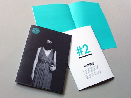
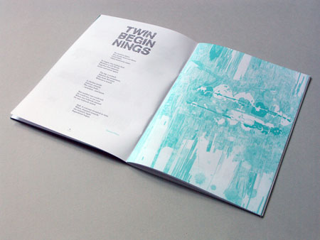
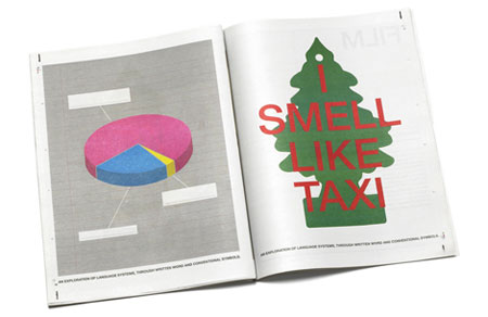
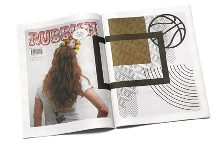
These two examples will use spot colour to define their colours as they have only used two colours and it will be cheaper than using 4 Colour CMYK.

Monochrome & Tints
I think that this cover uses a blue spot colour and a tint of that colour for 'Welcome to Yorkshire' and the other smaller type on the cover.
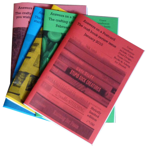
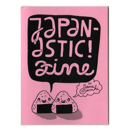
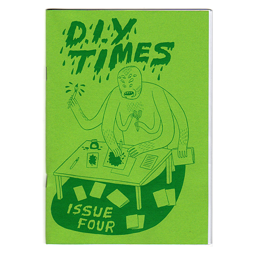
A lot of zines use monochrome printing to keep costs low and put emphasis on the subject matter
http://www.pushpinzines.co.uk/products/japanastic

Information & Wayfinding
CMYK

I think that these signs would use CMYK and digital printing as you would only need about 10 copies of it


The wide range of colour used in these maps would suggest that CMYK would be the best colour to use
Spot Colour


All of this colour will be a solid pantone colour, some of the wall decoration is probably some sort of vinyl sticker that will have been printed and cut using spot colours.

Monochrome & Tints


No comments:
Post a Comment