Monday 30 April 2012

13. Visual Communication Lecture Notes


  • Denotation is the obvious or literal meaning of an image
  • Connotation- the meaning behind an image- the thoughts and ideas that come to mind when proposed with a certain image.
  • Historic and contextual assosciation with images
  • Rhetoric: '(in writing or speech) the undue use of exaggeration ordisplay; bombast.
    2.
    the art or science of all specialized literary uses oflanguage in prose or verse, including the figures of speech.
    3.
    the study of the effective use of language.
    4.
    the ability to use language effectively.
    5.
    the art of prose in general as opposed to verse.'


  •  
Links to further reading:

Sunday 22 April 2012

Scream Pub- Design

I've been liking the recent graphic design going on in Scream Pubs (Dry Dock & The Library)

I found this pantone swatch based cocktail menu which was much more interesting than a regular menu where the cocktail comes served in a paint pot and the colour of the drink matches the swatch! interesting idea and relevant to revisiting colour theory!


Nice typography on drinks menu:

Type Hierarchy


12. Communication Theory


  • Understanding what communication is and how it works
Potential problems with communication:

Level 1  Technical  Accuracy

  Systems of encoding and decoding
  Compatibility of systems/need for specialist equipment or knowledge

Level 2  Semantic  Precision of language

  How much of the message can be lost without meaning being lost?
  What language to use?

Level 3  Effectiveness

  Does the message affect behaviour the way we want it to?
  What can be done if the required effect fails to happen?
  • Different ways of defining audience: e.g. social class, occupational, ability, gender etc.
BARB definitions:


The main audience categories are: individuals, adults, men, women, children, and housewives. These are further subdivided by age and social class.

Semiotics:
Semantics addresses what a sign stands for. 

Dictionaries are semantic reference books; they tell us what a sign means.

Syntactics is the relationships among signs.

Signs rarely stand alone. They are almost always part of a larger sign system referred to as codes.

Pragmatics studies the practical use and effects of signs.

Codes are organized rules that designate what different signs stand for.


Rhetoric:

Synedoche: 'a figure of speech in which a part is used for the whole or the whole for a part'

Hyperbole: 'obvious and intentional exaggeration.
an extravagant statement or figure of speech not intendedto be taken literally, as “to wait an eternity.”


Irony:  'the use of words to convey a meaning that is the oppositeof its literal meaning: the irony of her reply, “How nice!” when Isaid I had to work all weekend.'


Friday 20 April 2012

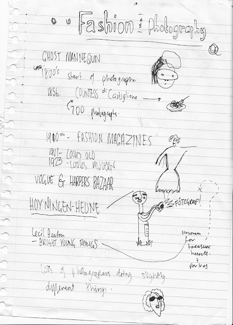
11. Fashion as Photography Lecture


  • photography began in the early 1800's
  • around 1856 Countess di Casttiglione began modelling and took over 700 photos
  • in the 1900's ashion magazines began with vogue and harpers bazaar.


Countess di Castiglione


Hoyningen Heune


Cecil Beaton


links to further reading:

http://www.fashion.net/art/photography/
http://www.dazeddigital.com/photography
http://www.vogue.co.uk/
http://bygonefashion.livejournal.com/

Cover Design Sheets


I am going to take this idea of deconstructing the title of the book and joining the letters together with lines so the viewer has to follow them to read. I will see if this works well digitally.


Thursday 19 April 2012

Influence CoP

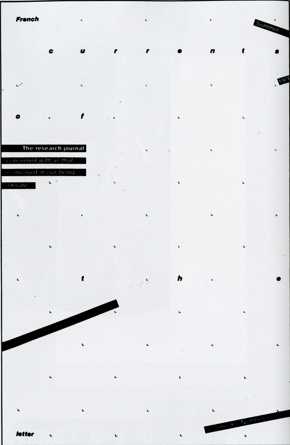
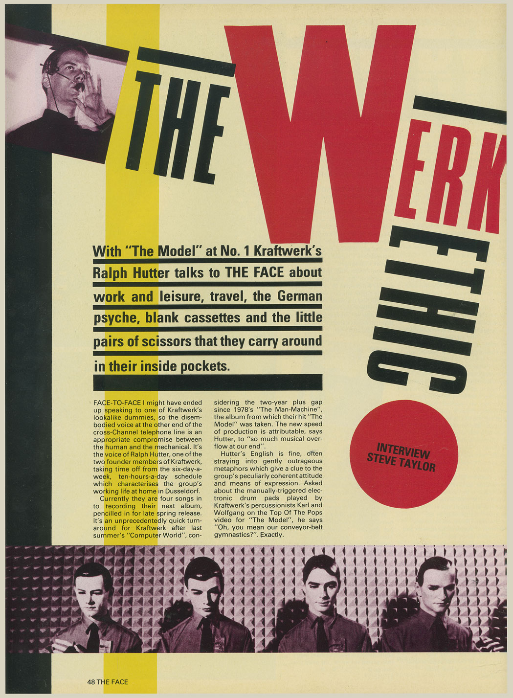
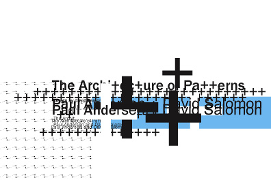
These are a selection of the images I will use as reference to design my publication in a post modern style


Visible Language: French Currents of the Letter (Research Journal)


Friday 6 April 2012

It's Your Choice!


"How to have fun when it's raining"
I want it to have fun and bright aesthetics, to appeal to 18-30 year olds and the young at heart.
I want it to look relatively mature so that it's obvious it's not aimed at children.

my games are going to include:

Drinking Games
  • Looking game
  • lleps ti
  • Letterfingers
  • Wordbomb
  • Bald man, naughty man, sing a song
Cards
  • On all fours
  • Ingvar snap
  • Irish snap
Good Clean Fun
  • Detective master
  • Kitchen Curling
  • Fast Animals
  • Won Too Trek

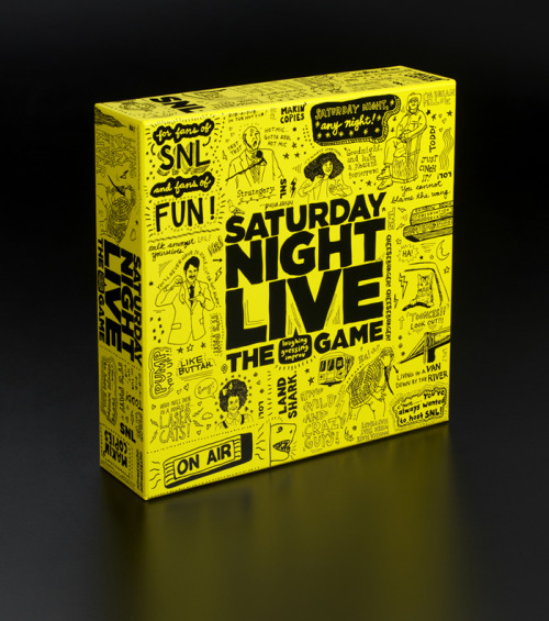
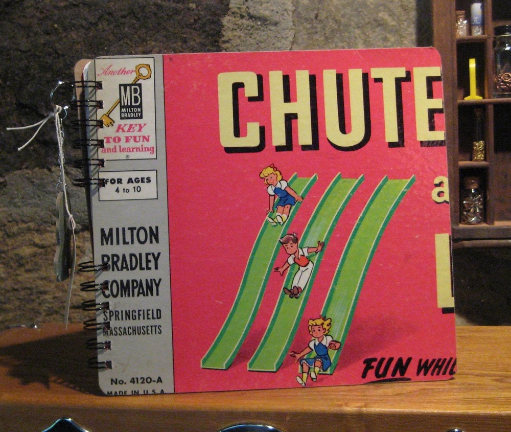
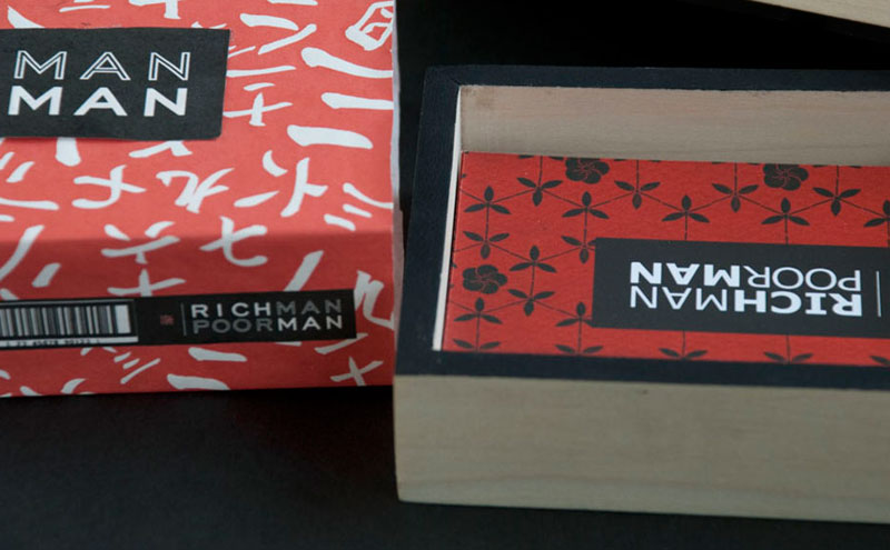
Exsisting games packaging:

]

This modern monopoly box looks very professional and mature, this is done by keeping it very simple and executing it in a very neat and tidy way and using expensive matte stock.


sans serif typefaces


Bold contrast


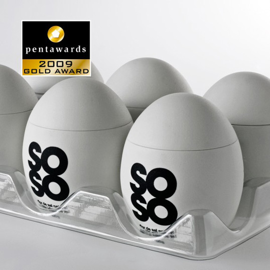
A more minimal approach to packaging gives it a classy and mature look:

penta_soso


Jooze


This is the sort of style i want to replicate, bright, pastel colours


Bright, contrasting colours are associated with games and fun


This minimal, modernist style would suit the style I have decided to adopt for the layouts and pages from the game books.


Colours