I am going to design 'a freshers guide to understanding your flatmates'
it will translate some of the more common slang that is used from all regions of the UK
it will fold out into a large scale poster that could be put on their wall. It will also act as an icebreaker as people from the specific regions can come into each others rooms and try and translate some regional slang.
Freshers material is all generally horrible:

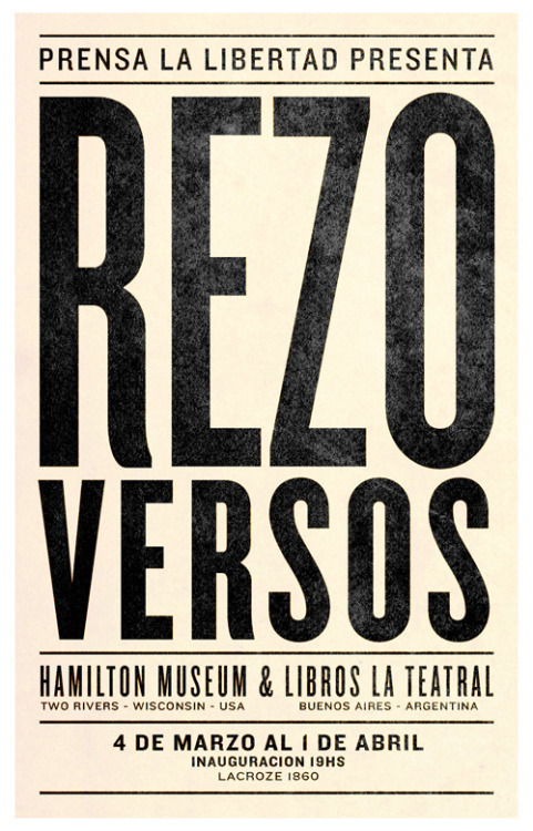
As my poster is going to be dealing with a lot of type I will look at typographic posters and how they work.

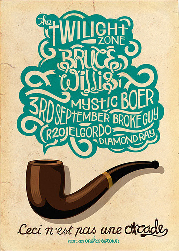
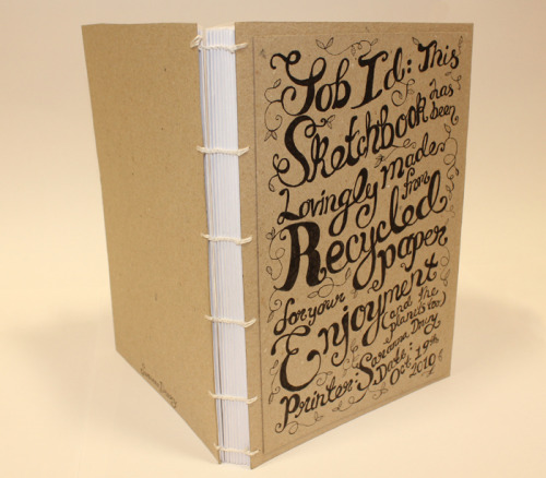
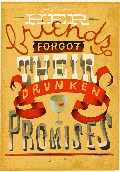
I quite like the idea of using bold block typefaces with different colours and close spacing to fill the poster.
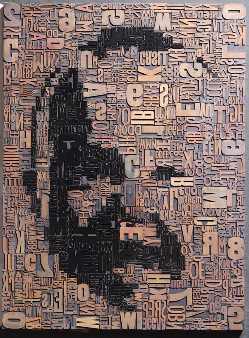
Or all the type coming together to make an image would really lend itself well to being a big poster
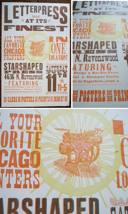
These letterpress posters would work really well, I could incorporate illustrations to pair with the slang:




No comments:
Post a Comment