
COLOUR
-Colour Models
CMYK & RGB
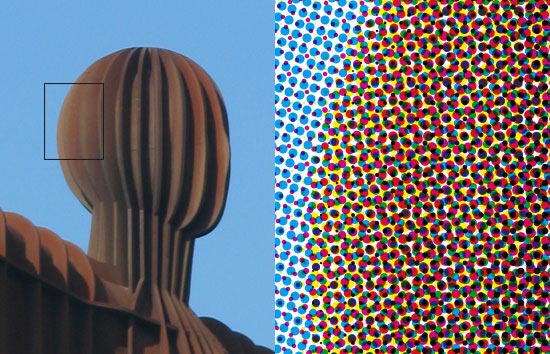
CMYK is generally used for most colour printing, especially if photographs are involved, in some cases it may be cheaper to use a couple of spot colours to reduce the cost. Different values and angles of each CMYK value add together to create a wide range of hues, shades and tints. How this works is shown in the photography above, the combination of the four colours and use of additive colour produces a smooth colour when viewed from a distance.
RGB is used for any screen based design, opposed to printing, colours used on screen are made up of light.
RGB is used for any screen based design, opposed to printing, colours used on screen are made up of light.
CMYK is an additive colour mode - when colours are layered the result is darker than the 2 colours that made it. This can be used to the designers advantage which I will look at for 'spot colours'.
RGB is a subtractive colour mode because it is made from light, the more colours that get layered the more the colour disappears and ultimately becomes white light.
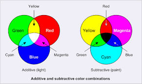
As you can see from this diagram, the result of layering RGB is CMYK + white, the result of layering CMYK is RGB + Black.
Pantone Matching System
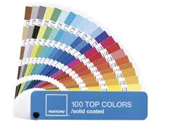
Pantone is used as an international reference system, this allows designers to communicate over the phone and specify the colours that they need without any chance of it getting altered in translation - if the Pantone code is communicated clearly. There are a large array of pantone swatch books that cover all different paints and how it looks on different types of stock. Having a Pantone reference book is essential when designing for branding and identity as this allows you to have a specific colour that is not going to change due to different printers or accidentally changing a value for the CMYK equivalent of the colour. Big brand companies will have a copyrighted Pantone colour that is unique to them and they will have rules that stop other - similar- companies from copying their brand.
Pantone also features some colours that are impossible to recreate using a CMYK mix which gives potential to print very vibrant and eye catching colours.
There are other colour matching systems available such as: HKS, TOYO, Trumatch and Focoltone. These systems can all be used in the same way as Pantone, but Pantone is the most widely recognised system for matching colour.
Hexachrome
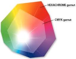
Hexachrome is a system developed by Pantone which uses the same principles of CMYK but with the addition of Orange and Green. This increases the colour gamut range and allows for more vibrant and bold colours to be printed. Hexachrome was never available fully to the public and was limited to people who had a trademark and patent from Pantone. The Hexachrome system was discontinued in 2008 due to dropped support from Adobe, however this system, or a similar system, could be used in the future to allow for more vibrant and dynamic printing.
CcMmYK
Another model that expands upon the traditional 4 colour system is CcMmYK, which features the regular CMYK plus a lighter Cyan and a lighter Magenta. This system was developed to reduce noticeable half tone dots that are used to produce a lighter tone of a colour. This system is used in some Inkjet printers to produce much higher quality photo prints.
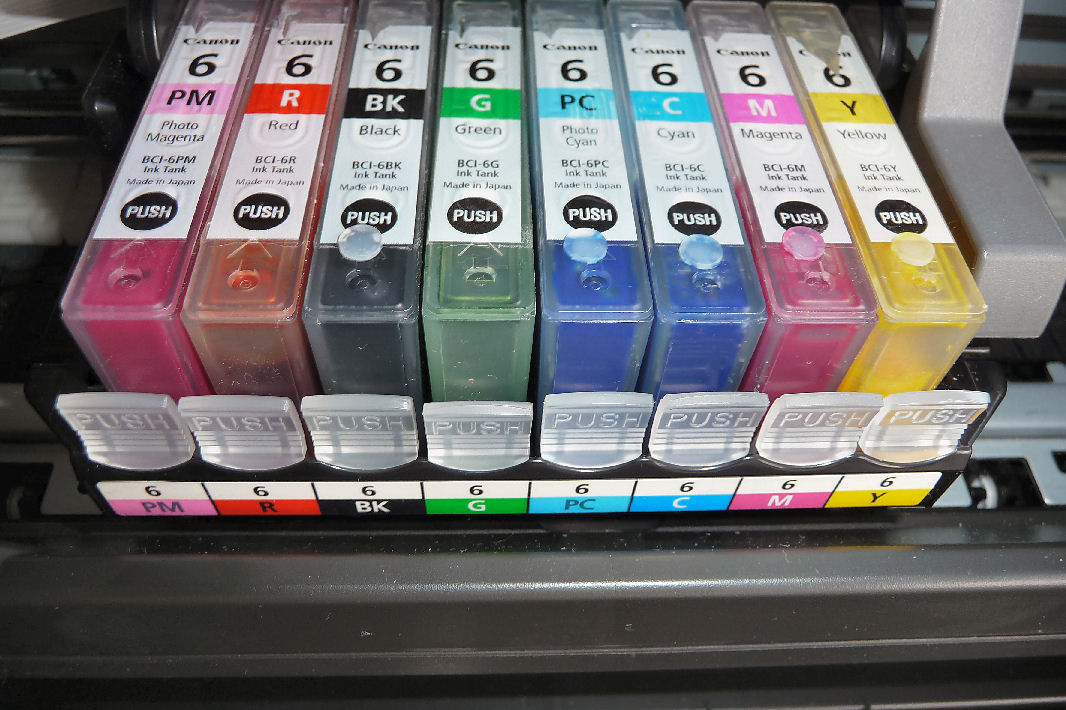
This printer features the CcMmYK model + Red and Green, this produces a more realistic and higher quality print when used on a glossy stock.
Spot Colour
Spot colours are used with reference to a colour matching system like Pantone that allows colours to be reproduced without any alterations. Sometimes spot colours can be used to reduce the cost of printing because you can design a publication that only uses 1,2 or 3 colours which will use less ink than 4 colour CMYK which uses combinations of all four colours to produce the colours that you want to be printed.
Spot colours also need to be used if what you are printing cannot be reproduced by CMYK such as, if you were designing for a brand that uses a specific set of colour outside of the CMYK colour gamut.
Spot colours provide a more solid and smooth finish, especially noticeable over large areas as it is one colour rather than a combination of dots that can be seen if you use a linen tester or magnifier on the print.
Spot colours cannot be used to accurately recreate a colour photograph, if you are designing a document that has colour photographs swell as the need for a specific spot colour you will need to use CMYK + however many spot colours you need.
When using spot colours it is also possible to use tints of that colour without any additional cost
Logo that would need to be printed in CMYK:

Logo that could be produced with a spot colour:

LAB
Lab is a colour mode that uses 3 variables, a and b alter colour and L alters the lightness. The LAB colour space covers all perceivable colour which exceeds that of RGB and CMYK. Lab colour is consistent regardless of the device that is producing it.

-Contrasts
There are a lot of ways that colour can be exploited for print that a designer can use to draw attention and give meaning to an object are part of the design.
These are some contrasts that can be used to communicate meaning or to create more vibrant and successful design:
Tone

Hue

Saturation


Temperature


Simultaneous

No comments:
Post a Comment