Tuesday, 29 November 2011

Audience for Hiccup advice

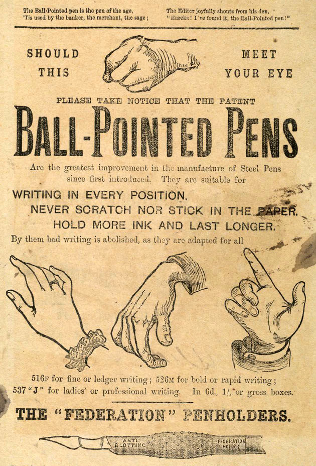
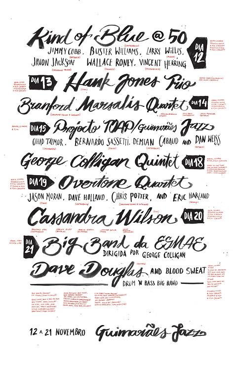
We chose to focus on designing our 'How To..' guide for the Victorian parent, to give it more focus and interest. Looking at some Victorian posters, this context will also let us really experiment with type and layout...


I think that, in particular, the numbers on this poster would lend themselves well to instructions to get rid of hiccups:


Monday, 28 November 2011

Hiccup 'Facts'

Some nice Hiccup Theories:

'In Slavic and Baltic folklore, hiccups are said to happen when the person who has them is being talked about by somebody not present'


'In India it is believed that when you hiccup, somebody in your family is thinking about you.' 


Remedies


  • Hold Your Breath
  • Drink Water
  • Breathe in a paper bag
  • Eat sugar
  • suck on a lemon
  • pull on your tongue


4.Lecture- Film Studies


  • Hitchcock was known as an Auteur, which means 'Author' 
  • Hitchcock was the main selling point of the film rather than the plot or anything else, similar to some well known directors of today like Tarantino.
  • Known as the master of suspense
  • He pioneered a lot of filming techniques such as the Dolly Zoom and montage.
  • He is renowned for using blonde women as heroines in his films


Dolly Zoom:


Links to further reading:

http://www.borgus.com/hitch/
http://filmdirectors.co/cgi-sys/suspendedpage.cgi
http://hitchcock.tv/
http://www.rottentomatoes.com/celebrity/alfred_hitchcock/

Thursday, 24 November 2011

SECONDARY RESEARCH

Fight Allergies
Qualative Research:
The most common allergies:

-- milk
-- eggs
-- peanuts (groundnuts) 
-- nuts from trees (including Brazil nuts, hazelnuts, almonds and walnuts) 
-- fish
-- shellfish (including mussels, crab and shrimps) 
-- soya
-- wheat

(Source: http://www.medicalnewstoday.com/releases/8624.php) 2009


After conducting some short interview I found that the best cure for most allergies is Piriton


Quantative Research

'Muriel Simmons, chief executive of the charity Allergy UK, said new research shows that 40 per cent of British children now suffers from allergies.
Mrs Simmons said: "What is worrying is that we are seeing a growth of children suffering severe allergies, like nut and other food allergies.
"The number of children with these kind of allergies has tripled in the last 10 years.
"There is evidence to suggest that this could be due to people eating a more diverse range of foods.
"For example, only a few years ago foods like kiwi fruit or mango were considered quite exotic and were much less widely eaten.
"But we are now seeing an increasing number of people suffering from allergies, where these foods are the trigger.
"I think as more, different, foods become part of our diet, we are likely to see more people being diagnosed with allergies."'


Further Colour Theory Research

I came across this artist who works solely with colour, these are some of the more interesting pieces which have solid contrasting colours.


Contrast of temperature, hue and saturation:


Complimentary and contrast of extension:


List of things to do to improve my aesthetic experience of life


Cut salmon


Top of Mountain


Hide and Seek somewhere I've never been


Tarzan


Falling from high places and not dying


Design Principles Notes 2

Key Elements of Graphic Design:


  • Frame 
  • Format
  • Figure
  • Ground
  • Composition
  • Visual Dynamics
  • Type
  • Image
  • Colour
  • Layour
  • Legibility
  • Readability


Symbol: Symbolises an apple
Sign: Sign for an Apple Mac
Signifier: Signifies quality, creativity, technology.

Visual Metaphor- An object that stands for something else
Metonym- e.g. a Cross is associated with a church 
Synecdoche- A part used to represent the whole, e.g. Statue of Liberty represents New York.


Monday, 21 November 2011

5x References for Essay

McDermot, C. (2008) 'Contemporary Design- Classics of Modern Design'. London, Carlton books limited.

Greenhalgh, P. (1990) 'Modernism in Design' London, Reaktion Books Ltd.   745 2

Hollis, R. (2006) 'Swiss Graphic Design' London, Laurence King.   741 604

Aynsley, J. (2001) 'A Century of Graphic Design' London, Octopus.  741 605

MoMA. (2008) 'Design and the Elastic Mind'. New York, Thames & Hudson.  745  2

End of module self evaluation


What skills have you developed through this module and how effectively do you think you have applied them?

In this module I have developed my initial idea and development of ideas skills, usually I find I start too narrow and don't consider every option to find which would work best but, especially with the 50x initial ideas in the 'Proverbially Yours- Message & Interpretation' it helped to be made to generate more ideas before settling because I found that my initial idea wasn't as good/ relevant as some later ideas.
I have also developed some practical skills, mainly Illustrator but also, designing work effectively for print and also considering that different printers print differently. One of the main skills I have learnt from this module is that keeping it simple is a lot more effective. I designed my proverb posters without colour restriction and I was sceptical about how it would look with only 2 colours plus stock but when I did it I found that it looked a lot better than the original. I applied this idea to my mail shot as well, keeping it simple, bold and effective.

What approaches to methods of idea generation have you developed and how have they informed your design development process?

A new method of idea generation I experienced on this module was the direct questionnaire for the Alphabet soup- typeface brief which was helpful in learning how to design for a specific market. It has also been helpful to talk about ideas with other people before settling on one. I will definitely produce more ideas than I think is necessary before starting further development in the future.

What strengths can you identify in your work and how will you capitalise on these?

I think that my work looks relatively 'hand done' and playful and I try not to make it too geometric and 'graphic', however it will be worth experimenting with this style or combining the two styles while I'm in my first year before I settle on a certain aesthetic.

What weaknesses can you identify in your work and how will you address these in the future?

From the start of foundation to now I think that I have been producing too much work which is supposed to be fun and lighthearted without an important or engaging message, I think that there are a lot of designers and illustrators that  do work like this so I want to make design that addresses a more serious message that is incorporated into the fun aesthetic. I still need to put more effort into making the final outcome look more professional in terms of printing, cutting and assembly. I also need to start briefs with a larger body of research and lots of ideas being generated so I know I am going down the best possible path.

Identify five things that you will do differently next time and what do you expect to gain from doing these?

  • Develop more initial ideas at the start of a brief before developing one.
  • Gather more research to inform my ideas at the start of a brief.
  • Try to stick to Illustrator rather than photoshop because results are much cleaner and more professional.
  • Put more consideration into the stock and type of paper I use for printing.
  • Experiment more with the colours I use.
How would you grade yourself on the following areas:


5= excellent, 4= very good, 3= good, 2=average, 1= poor

Attendance:    5       
Punctuality:    5
Motivation:     4
Commitment:  4
Quantity of work:   4
Quality of work:    3
Contribution to the group:   3

Thursday, 17 November 2011

Anatomy of type -Notes

Visual Literacy: the ability to derive meaning from images & the ability to produce images that communicate effectively to an audience.


Visual Communication: a process of sending/ receiving information through type & image


  • based on a shared understanding of meaning of images.
Considerations include: audience, context, media and form of distribution


TYPOGRAPHY
Different materials used when of producing type:

Stone

Type carved into stone, usually has serifs as this is where the chisel enters.


Sable-brush scripts
Sable allows for a more fluid and delicate typeface


Bone
Bone can be used to craft nibs of pens which results in type similar to that of sabre but with not as much fluidity.


Wood
Using wood as a way of printing dates back to 220 AD, Using wood creates very solid and level blocks of type of varying point sizes.


Lead
Gutenberg invented movable type in 1450, using lead to create glyphs.


Silicon
The applications of digital technology allows for type to be made out of silicon and cut using machines, which enables larger font families to be created with ease.

Timeline of Modern Typography
garamond

Caslon


Bodoni

Gill Sans

Univers
2000+


The Language of Type