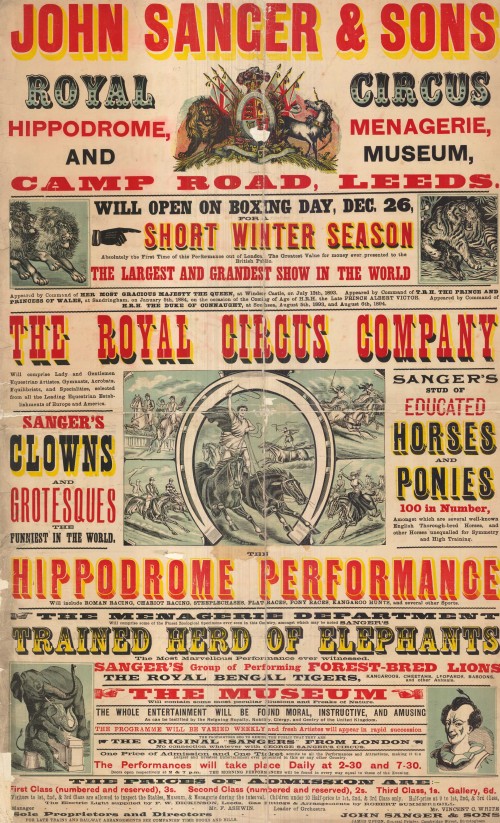
The small sections of information with big, bold headlines help to maintain the interest of the viewer. the most important information is the biggest attention grabbing parts of the attraction. There is a lot of consideration for the layout of this poster, it is almost perfectly symmetrical and the colours are well balanced throughout the poster.


The colours work very well on this poster, they are referencing christmas and the excitement and variety of the circus. I think that the typefaces used for this style of poster are a lot better than some of the fonts used today in this kind of promotional poster. If the paintings of the lion and ringleader were more simplified and graphic I think this would be an eye catching poster to see pasted up today.
A modern take on the old Victorian Style


No comments:
Post a Comment