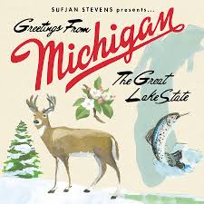
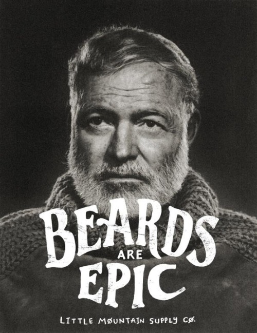
The aesthetics of this project must be nothing like the existing Forestry Commission and various other 'outdoor activity' companies.
It must still relate to nature, but not push a 'tree huggy' style and still maintain a cool and credible
It must still relate to nature, but not push a 'tree huggy' style and still maintain a cool and credible


I think this bold and gutsy style would appeal to the audience of groups of lads. It also get's rid of the interference of family and emphasises laughter and mischeif


This style is very contemporary and would appeal to a younger audience


Finding a balance between nature and 'trendy' and humorous imagery is essential to the success and effectiveness of this project


Using a simple illustrative style would be effective in showing what activities are available and it is a lot cooler than actual photographs of well mannered young men having wholesome fun in a forest.


No comments:
Post a Comment