
Wayfinding
3D and sculptural signage is aesthetically effective and also is more visible when being viewed from a distance.

I like the bold colours large scale of this stair signage, it works especially well against the white walls and cleanliness of the rest of the room.


This signage looks appealing and 'cool' but may not be suitable for the Type Factory

Again, this large scale typography is clear and would lend itself well to the application of typography museum signage, however if this was delivering important information it may become obscured by bodies if the museum was busy/ you will be standing in the way if you were trying to read it.

These arrows look effective and friendly however it may be difficult to follow the arrows if the layout of the room was complicated, they would need to be followed up by more signage / arrows as you get closer the the destination.


This looks visually interesting but the point size seems to be a too small, especially if there were a few visitors trying to read it at the same time and the blue, yellow and red text is way to small and low down for an adult to read comfortably:

The use of one bright colour in the branding makes the identity strong and familiar

Large blocks of colour grab attention and simple symbols can be easily understood by all

This piece of wayfinding design is visually effective and interesting but may confuse/ obscure the toilet signage.

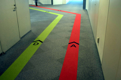
I like this idea of having a line that you can follow but it may become confusing if there are more than 2 lines


This is an interesting idea but I don't think that the information about what is on that floor is very clear

Web
The Tate website is clear and easy to navigation. I think this is because there is a minimal amount of text and the layouts are kept simple and use large, high quality images to do the majority of the communication.


In comparison this page looks a little cluttered as there are a few too many pictures of similar sizes, there is also a lot of text down the side which looks overwhelming and confusing to people who are unfamiliar with the artists.

A good balance of type and image:

No real hierarchy amongst the images on this page, nothing jumps out or instructs you what to look at first

Way too much text on this one I think, especially for the home page.

This website is well designed, all of the important information is on the first page with a photo slideshow of attractions

Poor webpage here, too much text with little hierarchy, standard font choices, default link aesthetics and lack of capitals and good grammar.

An existing website for a type museum that is apparently in London, does the job, nothing too flashy, clear layout and communication, high quality photographs.


No comments:
Post a Comment