The main ethos of Modernsim is 'Form Follows Function'
Josef Muller Brockmann http://www.josef-muller-brockmann.net/


Josef Muller Brockman is a very well known swiss graphic designer. His work is 'Modersnist' because it is carefully crafted using a strict grid system. All fonts used are sans serif, probably helvetica. The posters are straight to the point and eye catching. Solid bold colours are also a common feature of modernist graphic design.
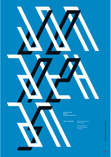
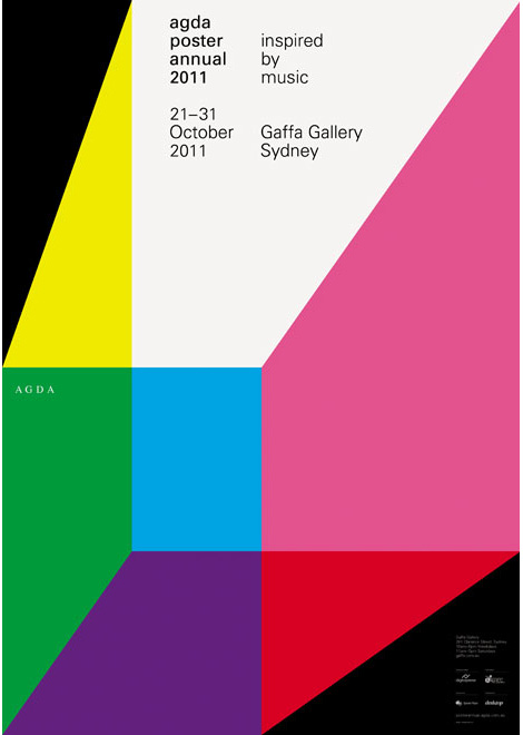
Mark Gowing http://markgowing.com/


Mark Gowing is a contemporary designer that takes a lot of influence from the modernist/ swiss styles from the start of the 20th century. Like muller Brockman, this work is all very bold and eye catching. All type is sans serif and there is a big variation of size of type, there isn't any unnecessary decoration that confuses or misleads the viewer of the purpose of the poster.
Paul Rand http://www.paul-rand.com/

Paul Rand operated throughout the modernist period. He uses bold colours, sans serif type, and very simple, understandable images. The priority being with 'function' for everything he does.
Max Schmid http://blog.eyemagazine.com/?p=417
Max Schmid is a swiss designer, the use of a grid system is obvious in the poster on the right, however the images he uses are a bit ambiguous and confusing without knowing what the poster is promoting, however he still sticks to Helvetica and bold, simple colours.
Atelier Ciba
Atelier Ciba uses simple illustration, bold colours, sans serif fonts and a grid system which makes his work Modernist even though he is designing today.


No comments:
Post a Comment