High Culture and Low Culture is the divide between fine art and graphic design. Fine art is high culture, aimed at the elite few who can understand and appreciate it. Kitsch brings high culture down by applying high culture artwork to very low culture 'tacky' products such as plates and mugs. Low culture is about what the people like and want, this can be related to products or film and music.
To apply this lecture to 5 graphic designers I will look at designers who design within pop culture e.g. for film and gig posters, I will also look at graphic design that is becoming high culture and is in a gallery rather than in a useful environment.
Greg Mike http://www.gregmike.com/
Born and raised in Connecticut, childhood trips to NYC in the mid-’80s exposed Greg Mike to the creative potential of reinventing public spaces through art and design. Always obsessed with the boundless energy and crisp line work of iconic American mid-century cartoons, by his early teens Greg began using the walls of his native state to fuse these two passions together.

Greg Mike is a graphic designer/ illustrator that has done these big character cans that are displayed in a gallery which is taking something that is low culture (illustraton/ comic characters) and making it high culture, similar to Lichenstein using comic book panels in his work.
Jamie Reid http://www.jamiereid.org/


Jamie Reid is a good example of a low culture designer, he took a very hand made and punk approach to design, designed for what the people wanted.
Boguslaw Sliwinski http://www.besign.eu/
Plates are an integral part of 'Kitsch'- taking high culture artwork and putting it on common products which makes it less avant garde and elite.
This designer has used the plate as a format for these interesting designs that interact with the food on the plate.
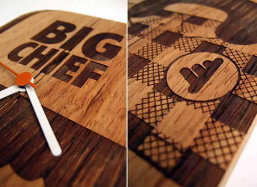
Furni, Big Chief & Jack Brandsma http://www.designboom.com/weblog/cat/8/view/6116/big-chief-furni-jack-brandsma-at-milan-design-week-09.html


These designers created this installation for Milan Design week, it doesn't really serve a purpose, its jsut 3d landcscapes cut and arranged in a gallery, similar to Greg Mike, this is border graphic design/ fine art and is high culture.
Jason Munn http://jasonmunn.com/posters.php
Jason Munn is originally from Wisconsin, but now calls Oakland, CA home. He began making posters almost ten years ago for local venues and independent musicians, designing under the pseudonym The Small Stakes. Now, working under his name, Jason continues to focus on posters, as well as design and illustration commissions.


Jason Munn designs posters for gigs which has always been assosciated with low culture as it is something that everyone can afford and enjoy.


No comments:
Post a Comment