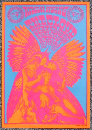
Moscoso http://www.victormoscoso.com/


Moscoso uses very high contrast colours, and very 60'2 psychadelic type, I like how the type isn't immediately readable. You have to spend longer looking at it and understanding it which I think is more engaging and 'human' than just reading helvetica instructions on a stripped back poster.
Art Chantry http://www.artchantry.com/


Art Chantry has a wide variety of different styles in his work, which is common for Post Modernism. again, very bright colours and hectic, crowded and vibrant layouts.
David Carson http://www.davidcarsondesign.com/

David Carson is verytypical of a post modern designer, he's all about experimentation and originality, he pushes the boundaries of communcation and he understands that the viewer is clever and can decipher and understand these posters- not everything has to be in helvetica bold for the viewer to understand.
Niklaus Troxler http://www.troxlerart.ch/

Niklaus Troxler is described as an artist/ designer, these posters are very post modern as they are extremely chaotic with bold contrasting colours.
Stefan Sagmeister http://www.sagmeister.com/
Stefan Sagmeister is a post modern designer, mainly to do with his disregard for a grid, breaking rules of 'graphic design' he's individual and, like Chantry, treats the viewer as an intelligent individual rather than a stupid number like Modernism did.

No comments:
Post a Comment